The visual identity of an academic institution is more than its colors, logo, and seal—it is a statement of history, tradition, and forward momentum, reflecting the ever-changing nature of higher education. Since its founding in 1832, Gettysburg College’s visual identity has evolved through a variety of seals, monograms, and wordmarks, each illustrating the College’s commitment to honoring the past while embracing the future.
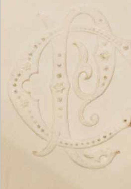
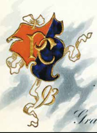
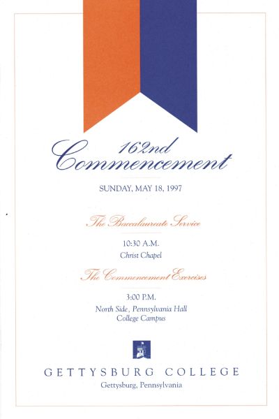
In the mid-19th century, the first depiction of the College’s logo appeared on formal documents such as these Commencement invitations. Each variation of this monogram contained the intertwined P and C to symbolize the College’s original name: Pennsylvania College.
In the early 19th century, the College’s colors were canary, red, and blue. These colors were later replaced in 1889, and this Commencement invitation from 1893 is the first recorded use of orange and blue outside of athletics.
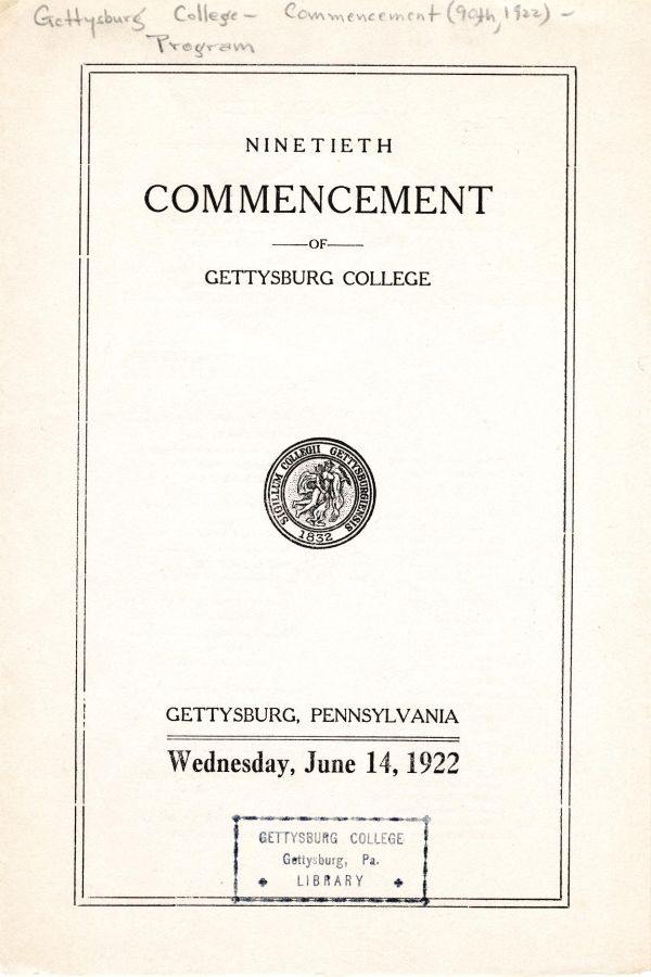
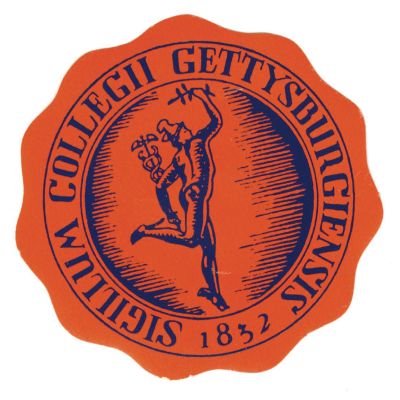
The early 20th century marked a significant shift in the College’s branding with the introduction of a seal. While the typography and design changed over time to reflect artistic trends, the seal consistently featured depictions of Mercury, a symbol of knowledge and interpretation.
In 1921, Pennsylvania College was renamed Gettysburg College, and the first prominent change to the seal was made the following year. The revisions included the new name and the founding year, the latter to reinforce the College’s historic roots.
The 1960s and 1970s were a time of creative experimentation in the College’s branding. Logos from this era featured the Pennsylvania Hall Cupola, which became a widely recognized element in future designs as well.
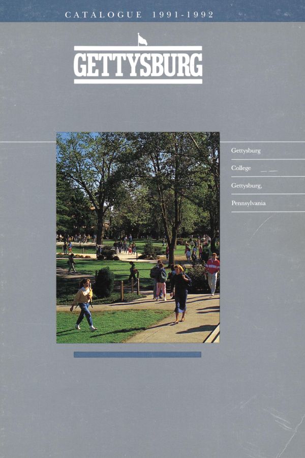
In the 1990s and early 2000s, the College introduced a new wordmark, which appeared on items such as viewbooks. During this era, the Mercury seal and images of the Cupola continued to serve as key branding elements.
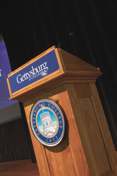
In 2002, Gettysburg College unveiled a wordmark and seal that would be used for 23 years. These symbols were woven into many aspects of campus life, including signage, apparel, and digital platforms, fostering a sense of tradition and community.
The College’s renewed visual identity was announced in July 2025. It will be implemented over a multiyear period and reflects the continued evolution of Gettysburg’s proud design tradition.
Grounded in nearly 200 years of impact, Gettysburg College’s visual identity was shaped from a collaborative process that brought together our people, our history, and the values that unite us as Gettysburgians.
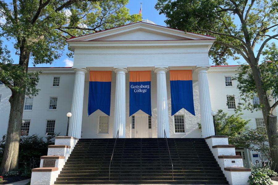
Uniquely us: Gettysburg College unveils renewed visual identity
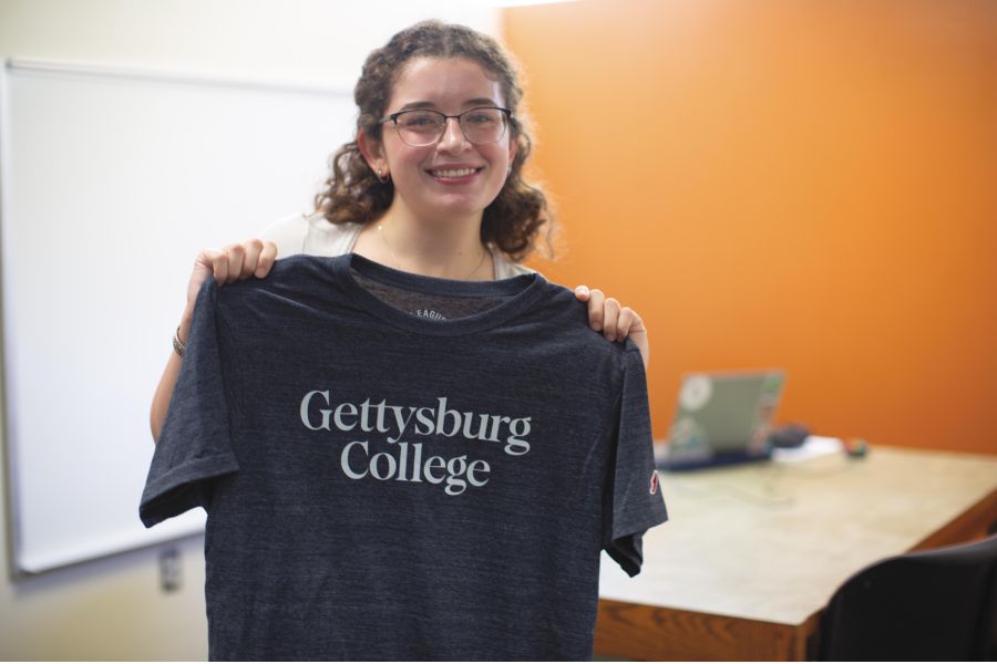
Gettysburg College wordmark
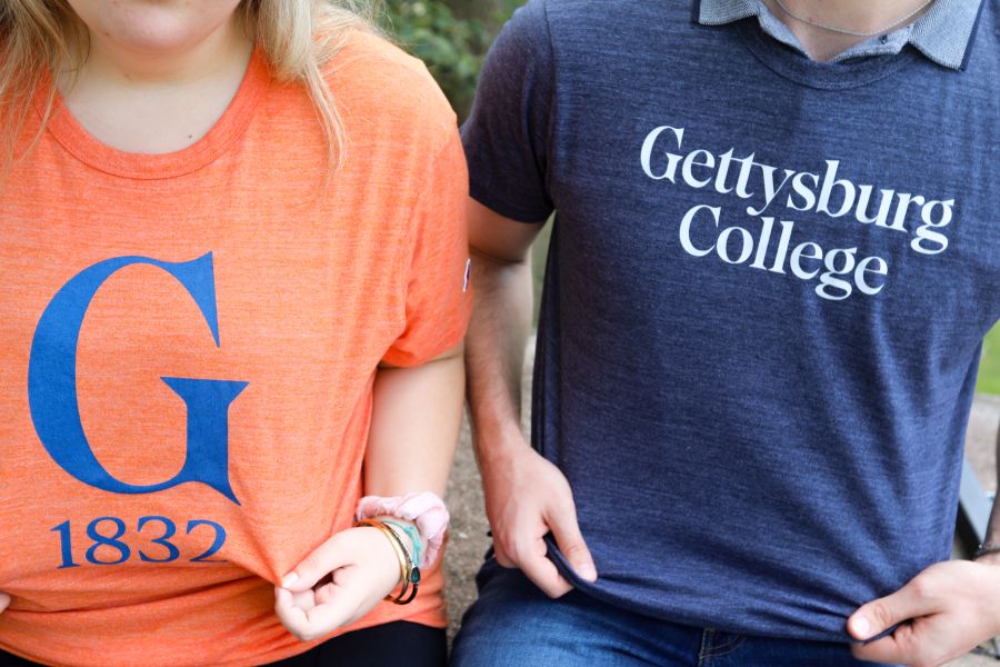
At the heart of our new visual identity is an elevated wordmark. The timeless design, featuring clean and elegant typography, pays homage to our hallmark liberal arts and sciences education through its traditional Serif letterforms. In the new wordmark, “Gettysburg” and “College” share equal presence, just as our students find equal meaning in the distinctiveness of our location and the transformative power of our education.
Gettysburg G
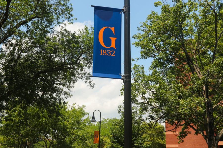
Complementing the wordmark is the introduction of the Gettysburg G—a distinctive standalone mark that draws inspiration from our people and place. The Gettysburg G delivers versatility in digital, print, and environmental spaces. Its unique design—leveraged in an 1832 lockup, as well as in traditional and outlined variations—reflects the loyalty and determination of generations of Gettysburgians who call our campus home.
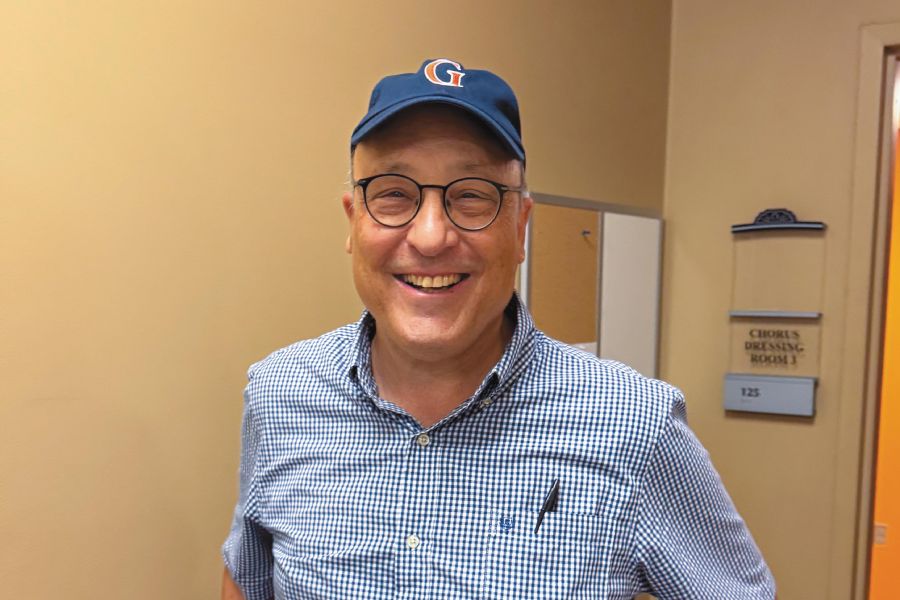
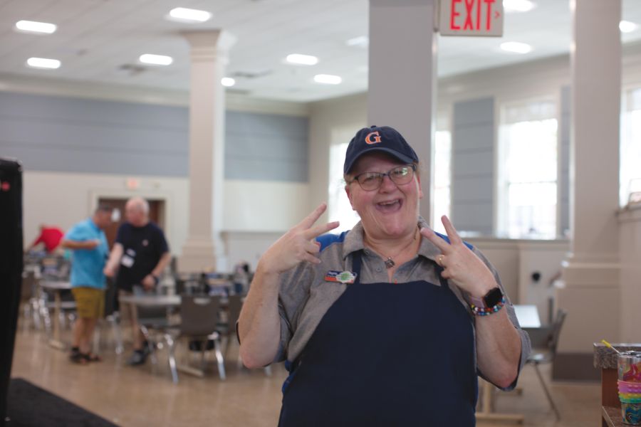
Athletic G
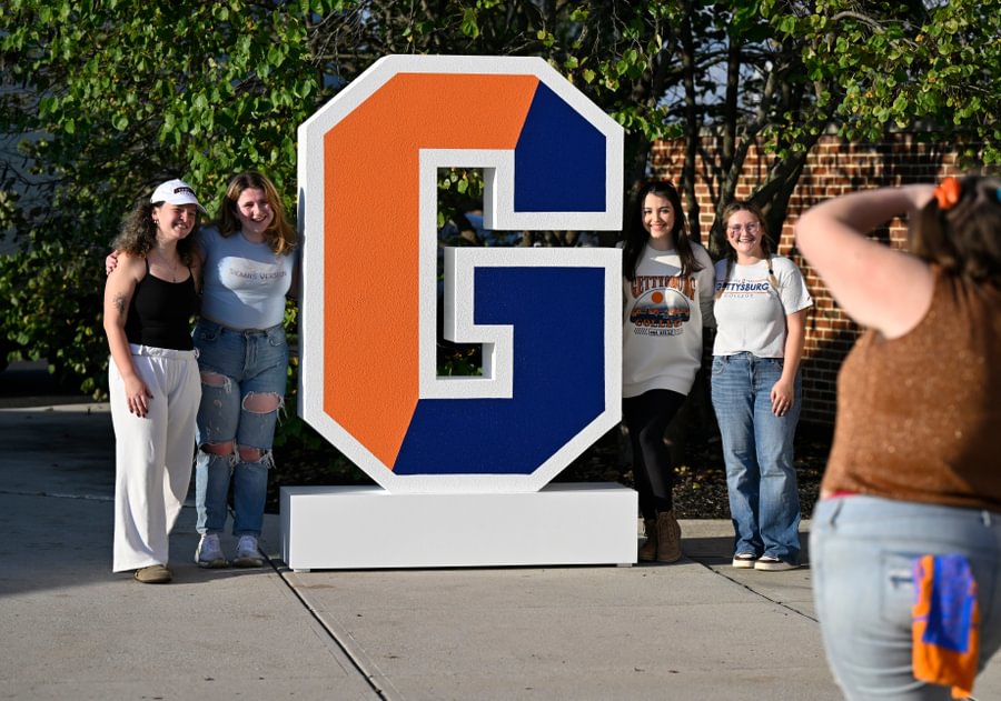
The Athletic G—affectionately known as the Split G—has long been a beloved icon of Gettysburg students and alumni. Its classic block letterform exudes strength and school pride, making it the ideal symbol of our Bullets athletic program. With the emergence of social media in the mid-2000s, the College adopted the Athletic G as a temporary institutional mark. Our new visual identity returns the Athletic G back to athletics—where it will continue to be sported by our Bullets teams and fans for years to come.
Gettysburg College seal
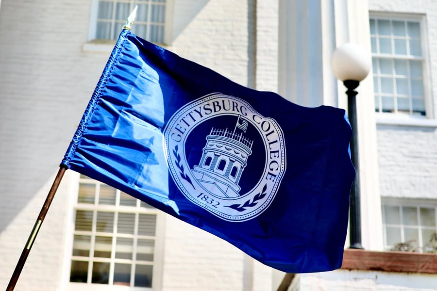
The Gettysburg College seal—reserved for use by the Board of Trustees, the Office of the President, and on our most formal occasions—has been refined to ensure greater clarity and flexibility. While longstanding elements such as the Cupola, American flag, and decorative beading remain prominent, the updated seal introduces new laurel framing. Representing victory, honor, and academic achievement, the laurels embody our College’s values and mirror the design found in the rotunda flooring of Pennsylvania Hall, where students process during Opening Convocation and Commencement—bookending their journey as Gettysburg students.
A special thank you
We extend a special thanks to the many individuals, boards, and councils who offered their time and perspective throughout our design process. Your voice and contributions helped ensure our renewed visual identity reflects the excellence of our entire Gettysburg College community.
From the Archives historical portion by Brooke Askin ’25
Posted: 08/28/25